Federal Spending Analytics
Slice and dice our award data any way you need, to find exactly the information and opportunities you need. By giving your our full award data set and allowing you to choose what to filter, you can answer detailed questions like:
-
Which contract vehicle does the Navy award the most money to for cybersecurity task orders?
-
Which contractors in the OASIS SB 8A pool will lose their 8A status in the next 12 months?
-
Which Washington, DC-area contractors are winning the largest number of awards for DevSecOps work?
Our graph elements are tied directly to your data filters, making it easy to immediately see the results from your queries. Save reports, filters, and graphs to easily see changes over time, or to create standard visualizations across multiple filters.
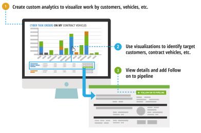
Go from high-level award views to pipeline opportunities with ease: Just click on hyperlinked opportunities to view the opportunity details in C2P, where you can easily add the opportunity, or its follow-on, to your pipeline.
Opening the page with no filters set will show an empty data set. This is because there is a substantial amount of data. You can choose to load all the data, but you will notice that this is a slow data load. Instead, filter on your most limiting attribute first, then load the data for faster speeds. Alternately, you can set a default filter to be used when you open the page that will load immediately.
- Filter the data by selecting the filter icon next to any column in the table view and selecting the information you want to view. Both the graph element and the table will update accordingly.
- Each column that can be filtered has a filter icon in the column header. Filters may be dropdowns, date constraints, or text fields.
- The description field filter searches across all of our opportunity artifacts, not just the description from FPDS, making it an incredibly powerful search field
Filters are applied at the funded award level (e.g., task order, grant). Contract Vehicles may show in your results where the primary dates, NAICS, or other values differ from the filter settings but a drill down to the award will show the correct settings.
- Each column that can be filtered has a filter icon in the column header. Filters may be dropdowns, date constraints, or text fields.
- To filter on Contractor attributes, click the blue double-arrow next to the filter icon in the Contractor column.
- New columns for contractor values will show in the grid. Filter on any combination of contractor and award attributes to find your niche.
- Look for teammates, competition, or companies losing their competitive advantage, e.g., losing their 8A status.
- New columns for contractor values will show in the grid. Filter on any combination of contractor and award attributes to find your niche.
- Save your data filters for reuse, and for use in reports (data and graphical element combinations). Export data to Excel using the Excel download button at the top right corner of the grid.
Building a chart from scratch works best if you have already applied your intended data filters to the pipeline or award analytics data. This way you can see if the data you are analyzing is show in its best light as you select the different components, and update your choices accordingly. While you should familiarize yourself with the fill set of chart component options linked above, there are only a few options that must be selected to form a basic chart.
- Select a grouping element. This is the element that will drive your chart. The group you select will determine how your data is sliced & diced in the analytics. As soon as a grouping element is selected you will see a chart or graph appear in the pane to its right.
- Toggle between the chart types to select the one that best fits the message that you are trying to convey with the analytics.
- Update the value to reflect the data you are trying to measure.
That's really all that is required to make a basic chart, although familiarizing yourself with all of the components and building more advanced charts is a great way to build more customized content.
To save your chart, you can do one of two things:
- To save the chart as part of a report, click a floppy disk at the report name level . The first disk, Save, will overwrite the settings for the existing report. The second disk, Save As, will save a new report that includes the chart.
- To save the chart to your favorites section (not to a report), click the Star+ icon. This will save the chart to your favorites.
Building a report is as easy as pulling up the data you want to see on the screen and saving when you have everything the way you want it. You can customize the data filters, grid elements, and chart elements, and all will be saved simultaneously into the report. You don't need to customize all three areas, but whatever you do have visible on the screen when you hit save is what will be saved.
First, click the icon to create a new report. The icon is visible in the report controller box, as well as in each section of the dropdown where you have permissions to build a report.

Or, a great shortcut is to open a report with a grid view and/or a chart you want to reuse, then to use "Save As" to save those elements with a new data filter that works for the report you want to build.

 Data filters
The data filters are any filters you apply to the data in the grid portion of the page. These filters are shown in either of two ways:
- If the column is visible on the page, the filter icon will be green to indicate a filter has been applied and saved. The filter icon will be orange if a filter was applied but has not been saved in the report, and gray if no filters have been applied to the data.
- If a filter was applied to a column not currently visible on the page, a message will appear above the grid letting you know that the data has been filtered on a given element.
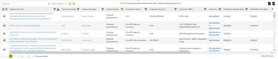
The grid view is defined as the columns visible in the grid display. On the Pipeline page, most Capture2Proposal and Custom Capture data elements can be shown in the grid view, so the combinations for which elements to display, and in what order, are virtually limitless. For the Funded Awards, options are more limited.
For the Grid in Pipeline:
- Select which columns to display using the grid editor icon in the top left corner of the grid to display all possible options.
- Options will display in an alphabetical list of all Capture2Proposal standard elements in green, then of all custom capture elements in blue.
- Drag and drop elements between the columns on the left, representing all unused elements, and the right, representing those in the view. You can also drag and drop elements on the right up and down to change the display order.
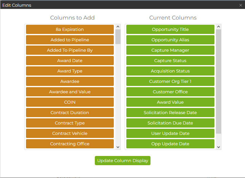
- Edit the columns further within the grid:
- Drag and drop columns to change their order.
- Resize columns by dragging at the edge of two columns.
- Lock one or more columns on the left side of the screen to keep them visible even if you scroll right to see additional data.
For the Grid in Funded Analytics:
You cannot change the column order or add custom options to the display, but you can still do the following:
- Resize columns by dragging at the edge of two columns.
- Expand or collapse the view of contractor attribute columns by clicking the blue arrows in the Contractor Column.
Select from a favorite graph to add it to the report, or build a new chart from scratch. Go to Chart Building 101 for all the information on how to complete these actions.
Before saving your report, check that the name in the report element box matches what you want for the report. If you are editing an existing report, this should be the case. If not, use the "Save As" icon to create a new report with a new name.
_900x322.png)
These reports are based on your company's UEI funded award data. Use them to understand what your wheelhouse is, how you compare to the competition, and to find recompetes you want to add to your pipeline to ensue you meet your long-term goals.
If you would like to update the UEI(s) associated with your account, contact support and let them know how you'd like it changed. All of the reports used to build this Dashboard can be found in the C2P Folder in Analytics. Click the charts to drill down on the award analytics for any chart.
Prime Performance (Last 5 Years) Funding By Year
This is a basic snapshot of your prime award funding for the past 5 years.
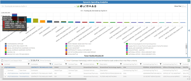
Top 5 Contract Vehicles by Customer (Last 5 Years)
What is your performance like on your Contract Vehicles? Chase the recompetes on your high-performing vehicles. Consider whether or not the effort is worth it to win a spot on vehicles where you aren't winning many (or any) task orders.
Top 5 Customers (Last 5 Years)
This view shows which customers you've done the most business with over the past 5 years, where you have the strongest relationships to chase more work.
Expiring Contracts (Next 3 Years)
This shows the opportunities you have won that have contract end dates in the next 3 years. Ensure the follow-ons for these opportunities are in your pipeline and that you are actively working to ensure you win the recompete as well.
Potential Task Order Opportunities Based on Past Performance
This is the counterpart to the Expiring Contracts chart: This chart shows expiring task orders on your contract vehicles and in your wheelhouse (i.e., with customers, PSCs, and Set-Asides that you use) that are not always your awards. This shows the money out there, and the areas where you could be gaining market share with work to win this business away at the time of the recompete.
Top 5 Customer Offices (Last 5 Years)
This is a more detailed view that correlates with the Top 5 Customers chart shown above it. Which customer offices you have supported the most in the past five years? This is the best look at where your team has formed relationships that may help win future work.
Dive deeper into the data, Download Results, and Improve Your Views!
Now that you know how to update the data, here are some additional tips and tricks for quickly diving further into the results, saving data and graphs, and more!
- Click any hyperlinked contract number to view the opportunity for that award in Capture2Proposal. Review the documents, the individual award spend, and choose whether or not to add the follow-on to your pipeline from this page; just click "Add to Pipeline" for that option. This is a great way to build your long-term pipeline and track opportunities where you want to become or remain competitive for future bids!
- Click on a Contractor's name in the data set. A new window will open with their organization profile, and an option to view their award analytics with or without subcontractor data, as well as work they're performed as a sub.
- When viewing a bar graph, select any portion of the graph to focus in on those results in the data set. The results in the data grid will automatically filter down to this results set. Click anywhere on the graph outside that section to return to the full data set again.
- Isolate the bar graph to the top 10, 25, 50, or 100 results... get more clarity and a better visualization based on the highest value results for your x-axis selected value. Data for all results will still show in the data grid when this type of data dive is selected; only the graph component will be limited for clarity. You can still choose to filter the data grid to match.
- Subcontractor data is visible by clicking the button to the right of the filter dropdown. Filtering to a specific subset of data will make viewing and analyzing subcontractor data easier.
- Select the best data download option for your needs. Select whether or not to include modifications, and how to present it in Excel to make it easy to manipulate. You can even download data in the subcontractor views now as well!
- Export any graph component in .png format, or download your aggregated table from the graph components section in Excel.